“People don’t quite
get what we do.”
A clearer offer and better page structure can give the right visitor a useful starting point.
Make the introduction count →

Choose a business. Follow its journey to a clearer, more useful website.
This scene’s artwork is not ready yet.
The story is available below. This preview is still in progress.The venue owner meets the couple at a wedding exhibition. They go home keen to explore the venue online.
Fictional venue · explore the estate and try a viewing request.
SEE IT IN ACTION
Watch a short process, then try the working demonstration. Browse by business.
Your website should make someone feel, “These are my kind of people”—and make it beautifully obvious what to do next.
Sometimes the business is excellent and the website is simply a few chapters behind. Let’s find the part that needs work before replacing the furniture.
A clearer offer and better page structure can give the right visitor a useful starting point.
Make the introduction count →Your work deserves a presentation that feels considered, credible and genuinely yours.
Put the proof to work →We need to understand the journey—not assume that moving a button will solve the business.
Try the three-question check →A website should start a conversation. Not require an interpreter.
You should know what we’re doing, why it matters and what happens next. Suspense is excellent television. Less excellent project management.
We talk about your customers, your business and what the current website is getting in the way of.
You get a clear scope, price and design direction before the build. No mysterious extras wandering into the room.
Review the real pages, test the important journeys and launch with a handover and a way back.
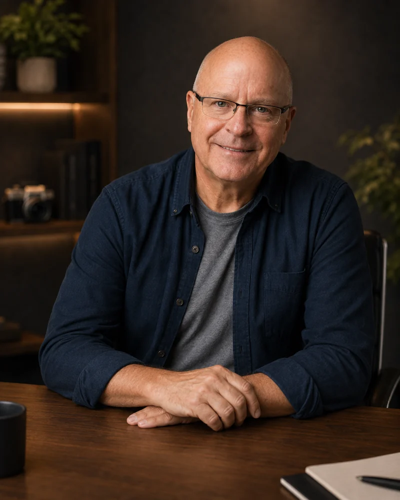
I’m Robin Custance: an Adelaide-based artist with a love of thoughtful design, useful websites and conversations that sound like actual people.
Tell me about your business, what you’re proud of and what your website isn’t saying. The holiday story is welcome too. It may even be the more interesting bit.
Not automatically. We first look at what works, what is hard to change and what your customers need. The agreed scope might be a focused refresh or a fuller rebuild.
That depends on the pages, content, platform and integrations involved. We agree a written scope and price before build work begins. The first conversation is about finding the right job, not selling the biggest one.
Mobile layouts get their own review: navigation, readable content, the example showcase and the enquiry journey. They are not simply desktop pages reduced to postage-stamp proportions.
No. The business stories are illustrative. They explain how clearer information can help a customer decide. They are not testimonials, measured results or booking promises. Available website prototypes are labelled separately.
No honest designer can promise that from a makeover alone. The offer, audience, traffic and follow-up matter too. We agree what the website needs to improve and what evidence to look for.
No. You need clear decisions, not an honorary computer science degree. I’ll explain the options in ordinary language. The playbook is there for curiosity, not homework.
Tell me what you do, what feels wrong and what a better website would help you achieve. We can start there.