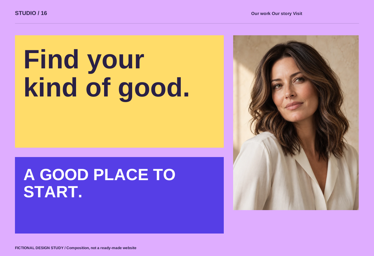
Build it around the business.
Distinct business-derived colour fields, crisp photography boundaries, large functional labels and a deliberately irregular yet aligned grid. Make service selection a useful guided choice. Mobile uses fewer simultaneous choices and generous tap areas.
Keep the purpose in view.
Do not recolour logos/products, use arbitrary bright colours or reduce contrast for novelty.
On smaller screens, recompose the layout, prioritise the main action and retain readable type. Keep keyboard controls, visible focus and a reduced-motion alternative.