Build it around the business.
Lively brand-derived accents; friendly real people or approved generic illustrations; simple labelled routes; big touch controls and concise answers.

07 / ART DIRECTION
Family services, community, everyday retail
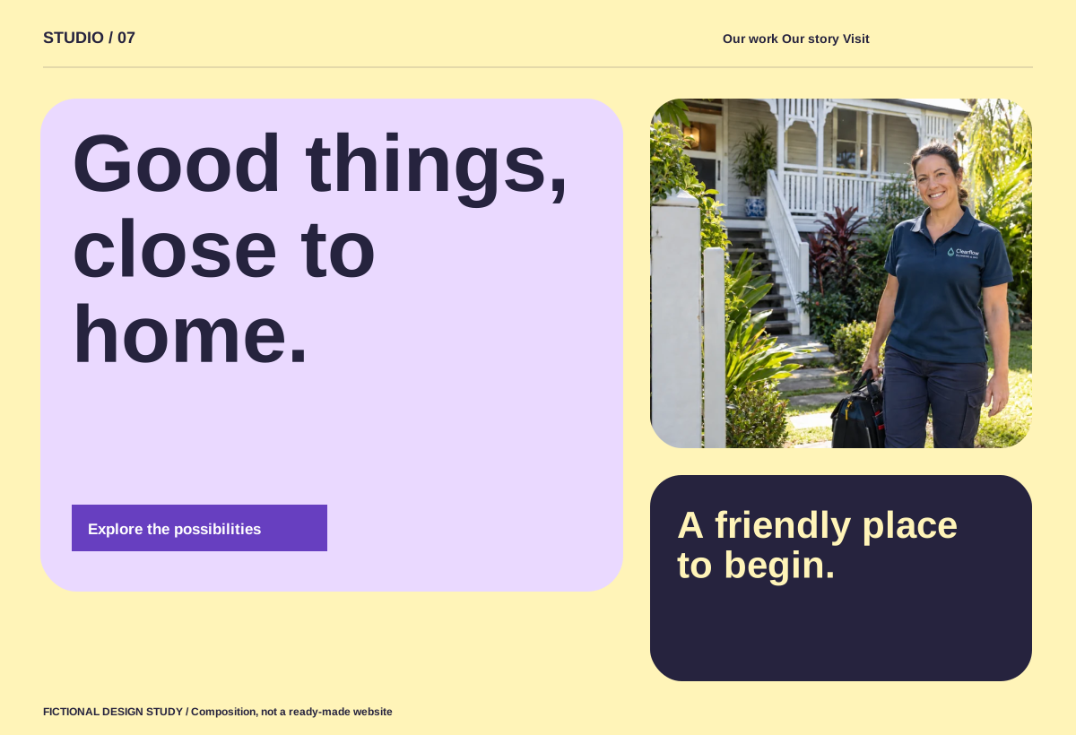
Composition preview. The pictured website controls are illustrative; the numbered design notes are interactive.
Lively brand-derived accents; friendly real people or approved generic illustrations; simple labelled routes; big touch controls and concise answers.
Avoid childish styling for adult audiences or fake customer families.
On smaller screens, recompose the layout, prioritise the main action and retain readable type. Keep keyboard controls, visible focus and a reduced-motion alternative.