
DigiThat
All twenty directions

09 / ART DIRECTION

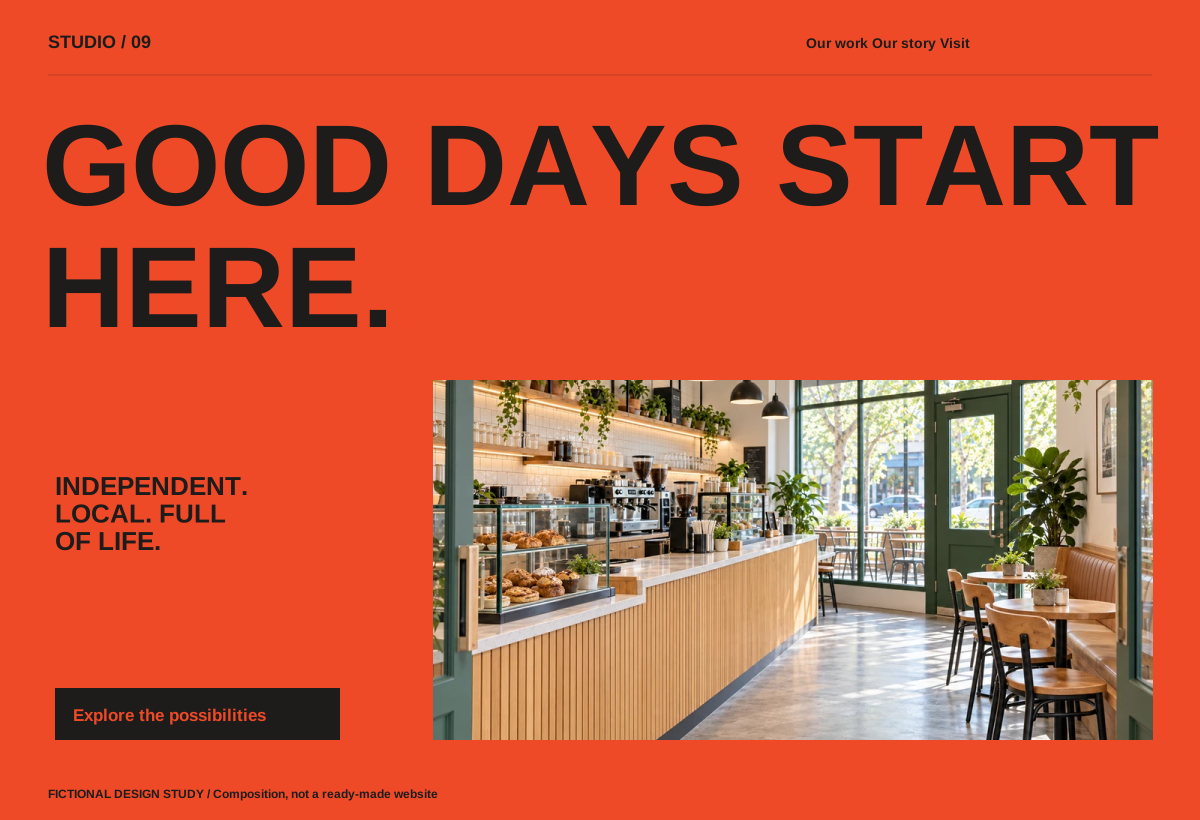
Bold typographic poster

Independent hospitality, makers, cultural venues

Bold typographic poster fictional interface design study

Composition preview. The pictured website controls are illustrative; the numbered design notes are interactive.

Build it around the business.

A typographic masthead across the opening; tightly cropped real detail photography entering the type grid; one useful action and a compact practical-information rail. Use confident sans-serif type and a business-derived accent, not generic luxury serif. On mobile put the action before the first large image.

Keep the purpose in view.

Do not use illegible text over busy photos or turn the whole site into oversized headings.

On smaller screens, recompose the layout, prioritise the main action and retain readable type. Keep keyboard controls, visible focus and a reduced-motion alternative.